Showing posts with label architecural drawing. Show all posts

Thursday, May 23, 2013

WHEN YOUR EYES ARE BIGGER THAN YOUR STOMACH Paducah Portfolio...12


Surely you have heard of this expression.  Well today I am presenting a case where my eyes, or in this case, my ambition and enthusiasm, were bigger than my determination and self-discipline.

Weille Buildings

The Weille Buildings on Broadway, current home of the Paducah School of Art and Design, has been calling to me with its elaborate and ornate detail, but a little voice in my head kept saying, “Billy, are you sure you want to do this?  You may be a tiger, but this is a lot of work.”  Of course I didn’t listen; it simply had to be included in my Paducah Portfolio, and I was sure I was up to the task of rendering the building, in watercolor and/or markers.  After all, this is what I do!

work in progress
So I started the laborious task of laying out the building, figuring scale and proportions and size.  I worked on the drawing for about 30 to 40 minutes every day, stopping when I began seeing double or started mumbling things to myself under my breath.  I eventually reached the stage where I could begin adding color to the completed parts…I needed to feel like I was making progress.  A little color, a little drawing, a little more color, a little more drawing, on and on, day after day, after day, when suddenly, out of the blue, it came to me.  I could not spend another minute on this without going nuts, and I knew how to extract myself from the quagmire that it was becoming.

Weille Buildings...markers...14x13

Every artist knows that there are times when we allow the viewers to complete the image using their eyes and their imagination, by leaving a part of the painting or drawing incomplete.  Often the viewer is not even aware of this.

Hey...I did all the hard work!

Sunday, October 4, 2009

RUMAGING IN THE FILE CABINET,

which I tend to do at times, usually when I'm not in the mood to do anything else, uncovered a series of drawings from 3 or 4 years ago. They were all done on clay mono types that had been printed on paper, rather than the non-woven synthetic fabric I usually use (trade name - Remay). I have always been rather fond of these, but it seems an affection shared by few others. I tell myself that some day I will give them a proper showing, but for now they are consigned to the drawer.


drawing #1 12x12


drawing #21 9x8


drawing #14 9x12


drawing #11 9x5

Saturday, March 22, 2008

THE VERSATILITY OF THE CLAY MONO TYPE

Following is a brief description of the clay mono type process as developed by Mitch Lyons some 25 or more years ago.

The clay monotype is a variation of the traditional monotype technique. A slab of stoneware clay 3/4 to 1 inch thick is pressed into a firm framed base mounted on a solid support table or bench. The surface is smoothed and leveled with the edges of the frame and is allowed to dry overnight to a “leather hard” consistency. There is no “correct” size: it can be small and portable or permanently situated in the studio. This clay base will act as the “plate” in the creation of the monotype. My current clay plate is 30x40” and is almost 6 years old. By keeping it covered with wet paper and plastic drapes it will last indefinitely.

Liquid clay-slip-is produced by mixing water and kaolin powder in a blender to a light pancake batter consistency and several coats are then brushed onto the clay slab. This slip also becomes the paint by the addition of pure pigments, dry or liquid, and is used to create the image by its application to the clay slab. The final result is a flat slab of clay in which the image is imbedded.

A moistened support, fabric or paper, is placed on top of the clay and pressure is applied using a roller or brayer. The support becomes impregnated with a thin layer of the clay resulting in a transfer of the image.

All the materials used in this process are archival and the pigments share the same light fastness as other tradition pigments.

The resulting one of kind images have characteristics unlike those produced by any other method. The variety of techniques that can be used in this process is limited only by the imagination and curiosity of the artist.

Here are several examples of how these prints can be enhanced and/or manipulated to create a variety of images,


Here the clay mono type (cmt) landscape was enhanced by adding the buildings and trees with acrlyic paint.


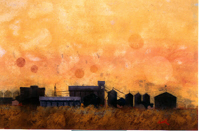
Prairie grain elevators...cmt enhanced with soft pastels


Architectural drawing...ink and pastel pencil on a cmt printed on paper


From an oil pastel series...oil pastel applied to a cmt on fabric with the borders still visible.

Tuesday, February 26, 2008

DRAWING BOSTON

It has been a very long time since I went out in the streets with my pen and drawing pad, and when I look at some of these old sketches of mine, and the work of other artists who go “out there”, I wonder why I don’t do that again. Well, actually I don’t wonder why, because I know why; I am far too comfortable in the studio. But I make myself feel better by believing that it is only a matter of time before I return to the streets.

If I had to point to one event or experience that radically changed my life it would be the 3 days I spent in Boston in November, 1976. I was there for an oncology seminar at the Mass. General hospital, but left the conference after the first hour and never returned. Instead I spent the next 3 days walking all over the city with my pen and sketch book drawing everything and anything that interested me. It is difficult for me to describe all that I felt, but I knew something significant was happening to me and to the way I saw my life and my world. Medicine would no longer reign supreme

.


All sketches were done with a Parker 45 fountain pen

Monday, December 17, 2007

COMPOSITION

As I’ve mentioned before, I had to teach myself how to work with watercolors, and I did so using what I have since clalled my coloring book approach. This entailed starting with a clean ink drawing, and then applying the wc neatly within the lines, without working wet in wet or graded washes, two of the more difficult skills of wc painting. Avoiding skies, trees, and everything else except the subject, almost always a building of some sort, the painting, by default, became a vignette.

As my vision expanded and the subjects became more complicated, I learned to become more creative in composing the painting, maintaining the vignette approach. Eventually I learned to paint skies, trees, and whatever, but still in the vignette format.

The following paintings show a progression from earliest to later work, from about 1980 to 1990.


Wednesday, December 5, 2007

WORKING IN MULTIPLE MEDIA


Delancy Place watercolor 12x60" '07

For 15 years my only medium was watercolor. In retrospect that was not surprising, living in Wilmington, Delaware, in the thick of the Brandywine tradition of the Wyeths where watercolorists greatly outnumbered the oil and acrylic painters. That was in the ‘70s and ‘80s. For the past several years I have been working in no less than 5 different mediums plus mixed media, two of these occasionally, and the rest on an ongoing basis.

I sometimes have misgivings about this practice, thinking that I’m spreading myself too thin and that galleries and dealers want to see more consistency in an artist. But I’ve come to realize that the only consistency that matters to me is the quality of the work, not the medium or the “style”.

My choice of a medium is determined by the subject and purpose of the painting, watercolor for urban landscapes and architectural portraits, acrylic for large, colorful, imaginative landscapes, pastels for tonal, moody rural landscapes, oil for more traditional landscapes, and clay mono types for abstract and otherwise nonrepresentational work. Oil pastels fall somewhere in between all of this, and the mixed media-collage-constructions are in a class my themselves.

Because of this approach visitors to my gallery will comment on my differen” styles”, but it is not a matter of my consciously choosing a style. It is the choice of the medium that dictates the resulting image. I cannot do with one medium what I do with the others. Does that make any sense?!


Hill Top series II clay mono type 15x32".

There is no guarantee that this will be the case 6 months from now, but hey, that’s what is so great about making art!

Saturday, November 3, 2007

SERIOUS ART ?


Architectural drawing #11 9x15"

Serious art. From the moment I decided I would leave my practice and pursue a career in art I was consumed with the notion that my art be serious. My biggest fear was that I would be seen as a doctor dabbling in art and indulging his hobby and I was determined to avoid that characterization. This would require a lot of work, because at that time my art consisted of pen and ink drawings with a little color provided by ink and/or markers. I quickly learned of the fugitive nature of the inks and set out to learn about watercolors. For the next 12 years watercolor was my only medium. Eventually I moved on to mono types with clay, pastels, acrylics, oil, and mixed media. I now work in all of these.

In 1981 I left my 9 year old private medical practice to be an artist. For 12 years I worked part time in emergency rooms as I pursued my new career. In 1993 I went back into private practice (an itch I just had to scratch!). In 2002 I retired completely from medicine. Twice I had to write letters to my patients telling them I was leaving, each time a difficult and painful task. I was breaking up relationships based on mutual trust and respect I spent years establishing. I was leaving them to Paint!? I felt then, as I do now, that my art has to be worthy of the sacrifice of abandoning medicine for art.

Serious art. Does anyone know what that means? Can art be serious, or is it the artist that has to be serious? Does that mean there is art, and there are artists who are not serious?
Can a non-serious artist create art that is serious?